Transforming your cooking space is easier than ever with two tone kitchen cabinet designs that bring depth and personality to your home. This popular trend allows you to mix colors and finishes to create a unique look that breaks the monotony of a single shade. whether you prefer a subtle transition or a bold statement, combining two different tones can make your kitchen feel larger, more grounded, and visually interesting.
Classic Navy Blue and White
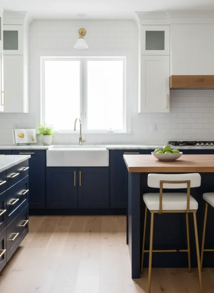
One of the most timeless combinations in interior design is pairing navy blue lower cabinets with white uppers. This look anchors the room with a deep, rich color near the floor while keeping the upper half airy and bright. It creates a sense of stability without making the kitchen feel small or closed off.
Using white for the upper cabinets helps reflect light, making the ceiling feel higher and the room more spacious. The navy blue adds a touch of sophistication and hides scuffs or marks that often happen on lower cabinets. This duo works perfectly with brass or gold hardware for a nautical yet elegant finish.
Sage Green and Cream
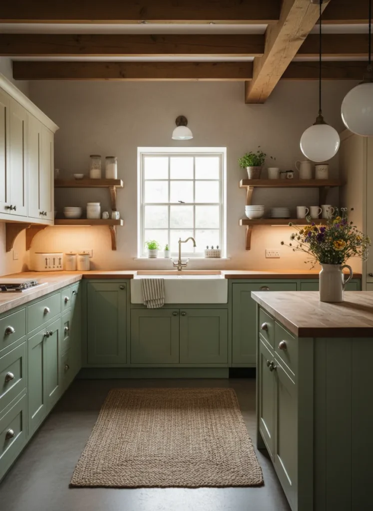
For a soft and organic feel, sage green paired with cream offers a calming atmosphere. This combination brings the colors of nature indoors, making the kitchen feel like a relaxing sanctuary. The muted green tone is versatile enough to act as a neutral while still adding a splash of color.
Cream creates a warmer transition than stark white, blending beautifully with the earthy green tones. This style works exceptionally well in farmhouse or cottage kitchens where comfort is key. Adding wooden textures through cutting boards or open shelving enhances the natural vibe of this color scheme.
Matte Black and Natural Wood
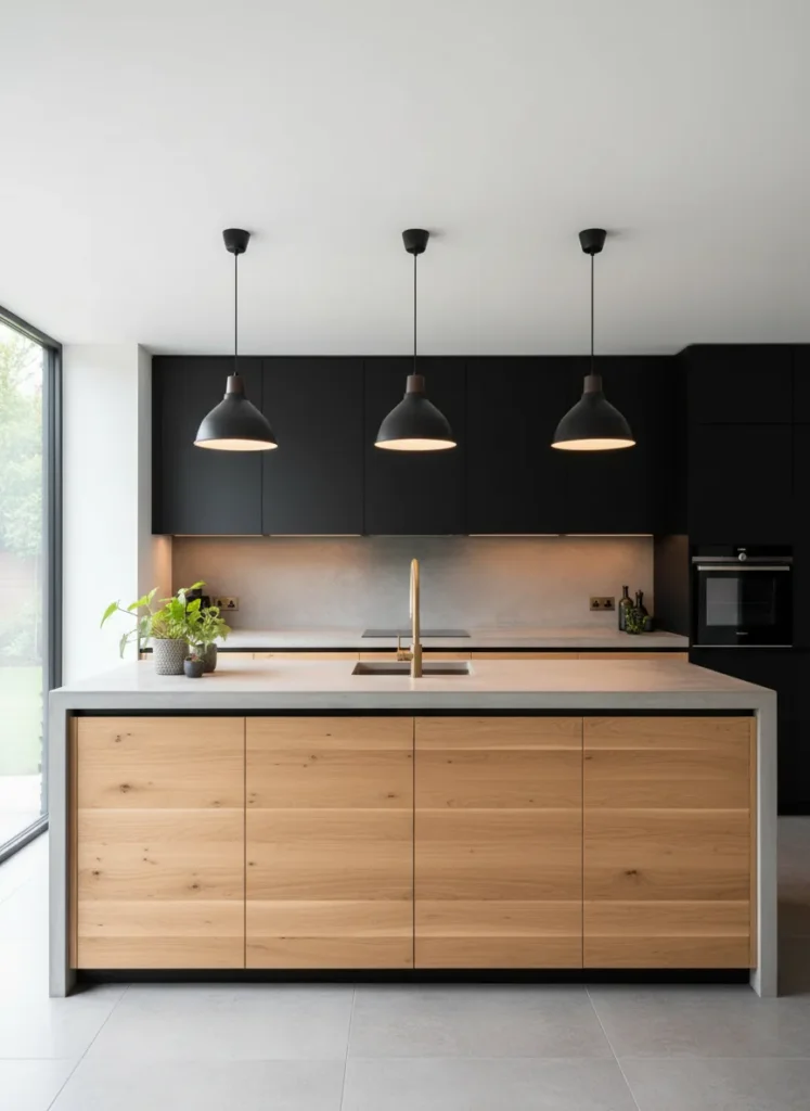
Mixing matte black with natural wood creates a striking modern industrial look. The darkness of the black cabinets adds drama and sleekness, while the wood grain introduces warmth and texture. This contrast prevents the black from feeling too cold or severe.
This design choice is perfect for those who want a bold kitchen that still feels inviting. The natural wood elements soften the sharp edges of modern design, creating a balanced aesthetic. It creates a high-end, designer look that serves as a focal point for the entire home.
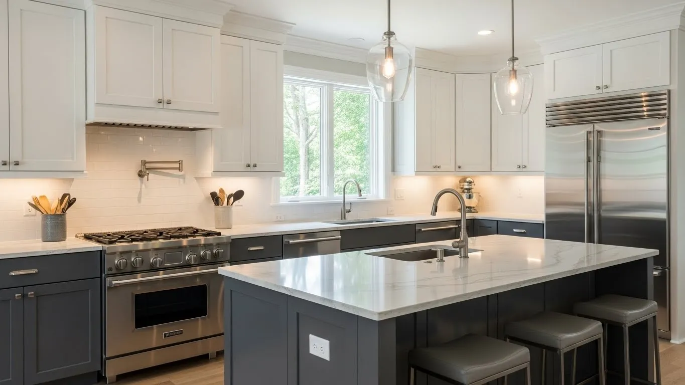
Charcoal Grey and Bright White
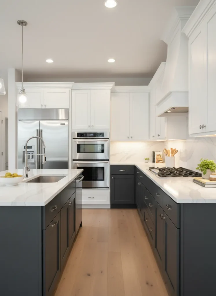
If you want a modern look that is softer than black, charcoal grey is an excellent alternative. Pairing charcoal lowers with bright white uppers creates a clean and sophisticated monochrome palette. It offers high contrast that defines the layout of the kitchen clearly.
The grey hides dirt and wear effectively, making it practical for busy family kitchens. Meanwhile, the white upper section keeps the workspace feeling open and illuminated. This color pairing is highly versatile and works with almost any style of flooring or backsplash.
Teal and Light Grey
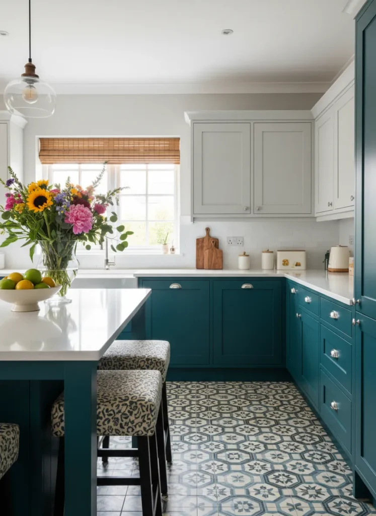
Injecting personality into your home is easy with a vibrant color like teal on your lower cabinets. Balancing this bold choice with light grey upper cabinets keeps the room from feeling overwhelming. The grey acts as a neutral backdrop that allows the teal to shine without clashing.
This combination is fun and creative, perfect for homeowners who want to step away from traditional neutrals. The cool undertones in both colors create a cohesive look that feels fresh and energetic. It pairs wonderfully with geometric floor tiles or a fun backsplash pattern.
White Uppers and Greige Lowers
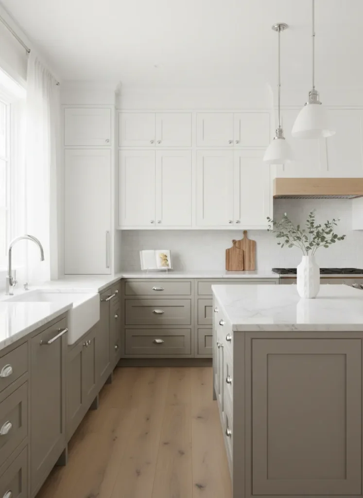
Greige is the perfect blend of grey and beige, offering a warm neutral that is very trendy. Using greige on the bottom and white on top creates a very subtle two tone effect. This low-contrast look is ideal for those who want depth without a stark division of color.
This palette creates a soothing and cohesive environment that feels effortless. It adds just enough weight to the lower half of the kitchen to ground the space while maintaining a minimalist aesthetic. It is a safe but stylish choice that increases resale value due to its universal appeal.
Midnight Blue and Natural Oak
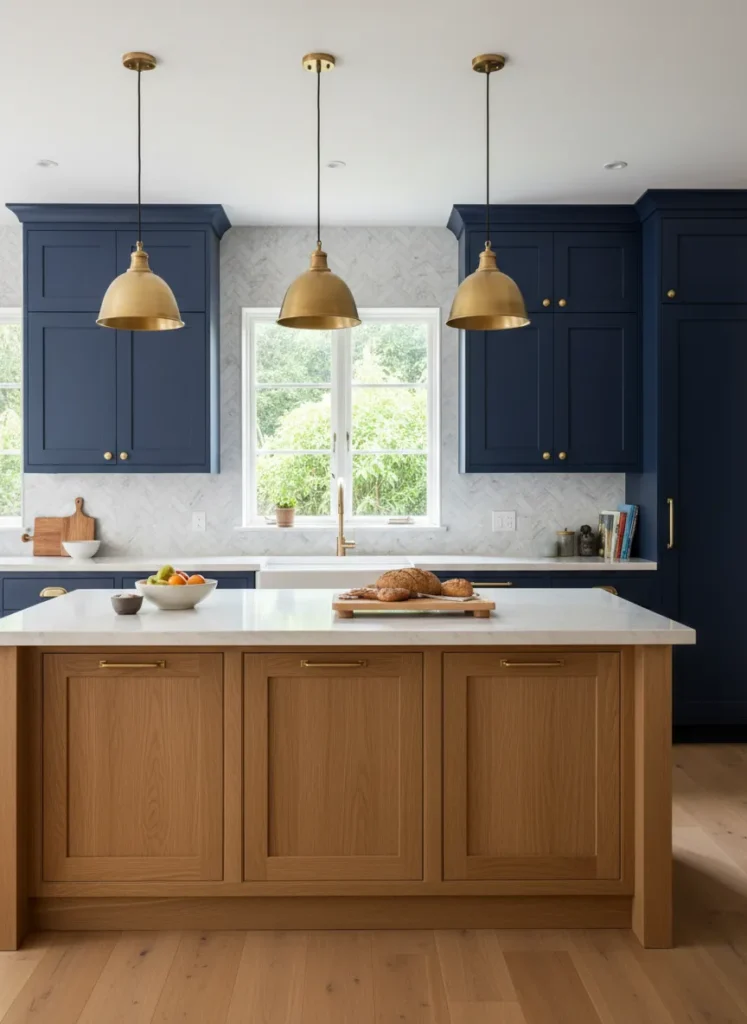
Combining midnight blue with natural oak wood results in a luxurious and rich aesthetic. The deep blue brings a sense of royalty and calm, while the oak adds organic warmth. This pairing often feels more expensive and custom-made due to the complexity of the textures.
You can use the blue for a large pantry wall or island while keeping the rest of the cabinetry in wood tones. This method highlights specific areas of the kitchen, turning cabinetry into furniture-like features. It is a sophisticated choice that works well in both traditional and contemporary settings.
Forest Green and Brass
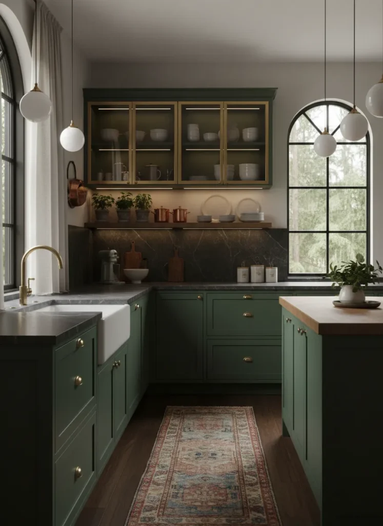
Forest green is a deep, moody color that brings a sense of the outdoors and old-world charm. When paired with brass accents or glass-front upper cabinets, it feels incredibly elegant. The green acts as a neutral in this context, providing a solid base for metallic accents to pop.
Using glass doors for the upper cabinets instead of a solid color lightens the visual load. It allows you to display beautiful dishware while enjoying the rich color on the bottom. This design choice creates a curated and collected feel, reminiscent of a cozy library or study.
Mustard Yellow and Charcoal
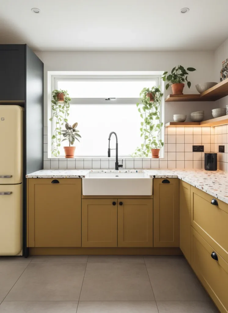
For a bold and retro-inspired look, mustard yellow and charcoal grey make a stunning team. The yellow adds a cheerful and sunny disposition to the space, while the dark grey keeps it grounded and modern. This high-contrast duo is for the adventurous decorator.
The grey upper cabinets prevent the yellow from looking too bright or childish. Instead, the combination feels curated and artistic. It works particularly well in mid-century modern homes or spaces that need a boost of energy and warmth.
Pale Blue and White
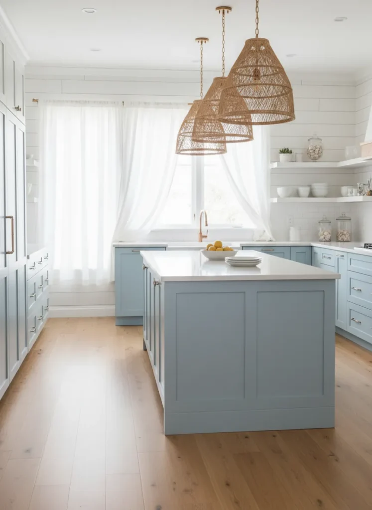
Pale blue and white is the ultimate combination for a breezy, coastal-inspired kitchen. The soft blue mimics the color of the sky or sea, creating an instantly relaxing vibe. White uppers ensure the room feels filled with light and airiness.
This look is perfect for smaller kitchens as the light colors reflect natural light, making the space appear larger. It evokes a sense of cleanliness and freshness that is very appealing in a cooking space. Pairing this with light wood floors completes the beach house aesthetic.
Matte Black and White Marble
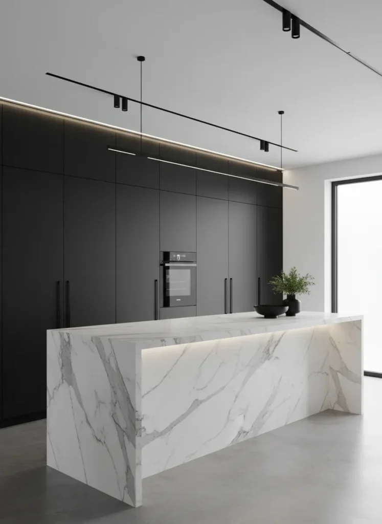
Creating a focal point with a black and white scheme is a hallmark of modern minimalism. Using a block of matte black cabinetry against a white marble island or backsplash creates intense visual drama. The contrast is sharp, clean, and undeniably chic.
This design relies on the texture of the marble to soften the flatness of the matte black. It creates a gallery-like atmosphere where the kitchen feels like a piece of art. This style is best suited for open-plan living areas where the kitchen needs to look sleek and uncluttered.
Blush Pink and Grey
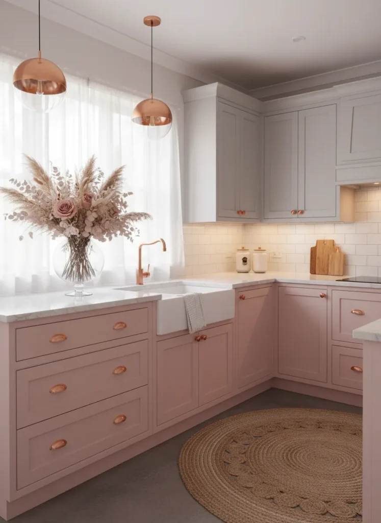
Blush pink is becoming a popular neutral that pairs wonderfully with soft grey. This combination creates a gentle, romantic, and chic aesthetic that feels very welcoming. The grey tones down the pink, ensuring the kitchen doesn’t look like a nursery.
This is a great way to introduce a feminine touch without it being overpowering. The colors are soothing and work well with copper or rose gold hardware. It creates a unique, boutique-style kitchen that feels personal and curated.
Emerald Green and White
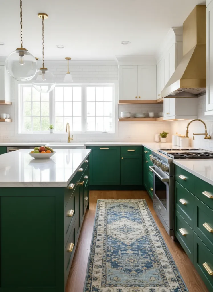
Emerald green is a jewel tone that adds instant glamour and vibrancy to a kitchen. When paired with crisp white uppers, the green pops beautifully without darkening the room. This combination feels fresh, lively, and sophisticated.
The white upper cabinets act as a blank canvas, allowing the green lowers to be the star of the show. This balance prevents the strong color from feeling heavy. It is an excellent choice for adding character to a standard builder-grade kitchen layout.
Espresso and Beige

For a warm and traditional feel, espresso wood tones mixed with beige paint is a classic choice. The dark wood adds richness and depth, while the beige keeps the upper visual field light and warm. This avoids the sterility of bright white while maintaining brightness.
This combination is very forgiving of stains and everyday wear, making it practical for families. The warm undertones in both colors create a cozy environment perfect for gathering. It works beautifully with natural stone countertops like granite or travertine.
Navy Blue and Gold

For those who love glamour, pairing navy blue with metallic gold accents or finishes is a showstopper. You can use navy for the main cabinetry and introduce gold through hardware, or even a metallic finish on a feature cabinet. The contrast creates a high-end, luxury feel.
The deep blue provides a sophisticated backdrop that makes the gold sparkle and shine. This look is perfect for evening entertaining, as it creates a moody and intimate atmosphere. It turns the kitchen into a statement room rather than just a utility space.
Terracotta and Sand
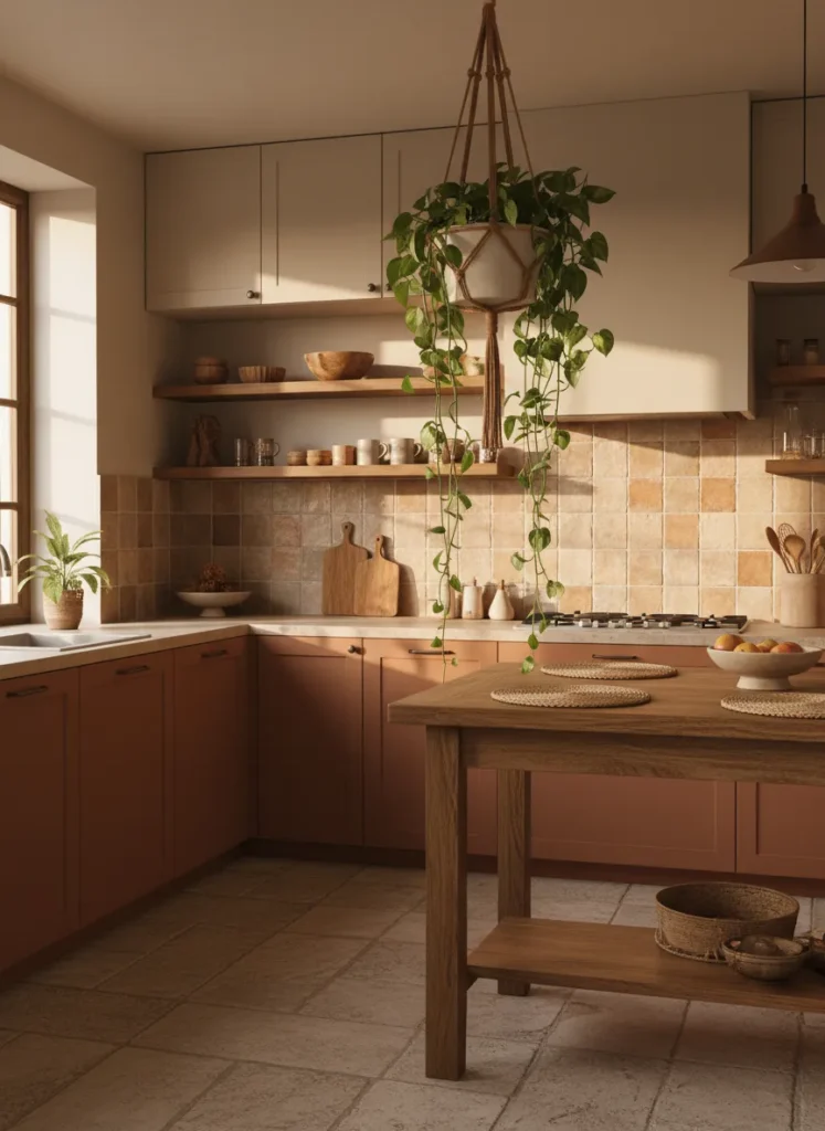
Earthy tones are making a huge comeback, and terracotta paired with sand is a perfect example. This warm, desert-inspired palette makes the kitchen feel sunny and organic. The reddish-brown terracotta grounds the space, while the sand color keeps it feeling open.
This combination works beautifully with natural textures like rattan, clay, and wood. It creates a relaxed, bohemian vibe that is very inviting. It is a great way to add warmth to a kitchen that might otherwise feel cold or clinical.
White and Walnut
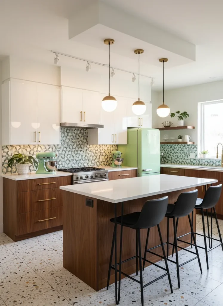
The combination of white and walnut wood is a staple of mid-century modern design. The rich grain of the walnut brings warmth and texture, while the white keeps the look clean and modern. It strikes a perfect balance between organic and man-made materials.
This pairing is timeless and unlikely to go out of style quickly. The white uppers help reflect light, which is practical for food preparation, while the wood lowers conceal fingerprints. It creates a sophisticated look that feels both vintage and contemporary.
Plum and Cream
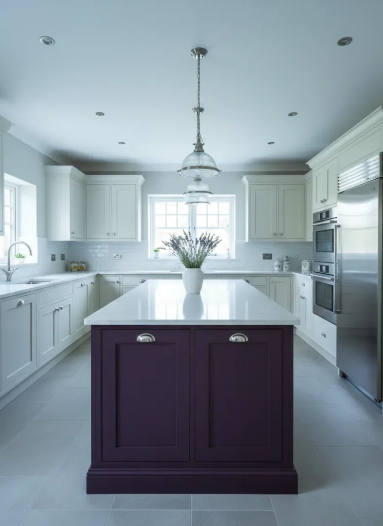
Plum is an unexpected but incredibly elegant choice for kitchen cabinetry. When used on an island or lower cabinets against cream uppers, it adds a regal and unique touch. The cream softens the purple, preventing it from feeling too dark or gothic.
This color scheme is perfect for homeowners who want something different from the standard blues and greens. It adds a layer of depth and mystery to the kitchen design. It pairs exceptionally well with silver or brushed nickel hardware for a cool, polished look.
Slate Blue and Light Wood
Slate blue creates a cool, calming aesthetic that pairs perfectly with light woods like birch or ash. This combination is often seen in Scandinavian design, prioritizing simplicity and functionality. The muted blue adds color without being loud.
The light wood uppers add a natural element that warms up the cool blue tones. This balance creates a serene and harmonious space ideal for cooking and socializing. It is a clean, modern look that feels approachable and lived-in.
Olive Green and Stone Grey
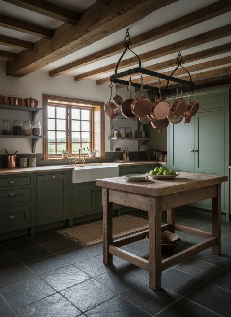
Olive green and stone grey create a rugged, rustic look that is perfect for country homes. The olive tone brings in the colors of vegetation, while the grey mimics natural rock. Together, they create a very grounded and earthy palette.
This combination hides wear and tear very well, making it great for a hardworking kitchen. It pairs beautifully with raw materials like exposed beams, brick, or slate floors. The result is a cozy, inviting space that feels connected to the outdoors.
Conclusion
Embracing two tone kitchen cabinet designs is a fantastic way to infuse your home with style and character. By mixing colors and materials, you can create a space that is not only functional but also visually stunning. Whether you choose bold contrasts or subtle shifts in tone, these ideas prove that two colors are often better than one when creating your dream kitchen.