Creating a sanctuary where you can escape the stress of daily life begins with choosing the right palette for your walls and decor. Your bedroom should be a haven of relaxation, and the colors you choose play a significant role in influencing your mood and sleep quality. Whether you prefer soft neutrals, muted pastels, or deep moody tones, there are endless ways to transform your space into a restful escape. In this guide, we will explore fifteen calming bedroom color ideas that will help you design a peaceful retreat tailored to your personal style and comfort needs.
Serene Sage Green Sanctuary
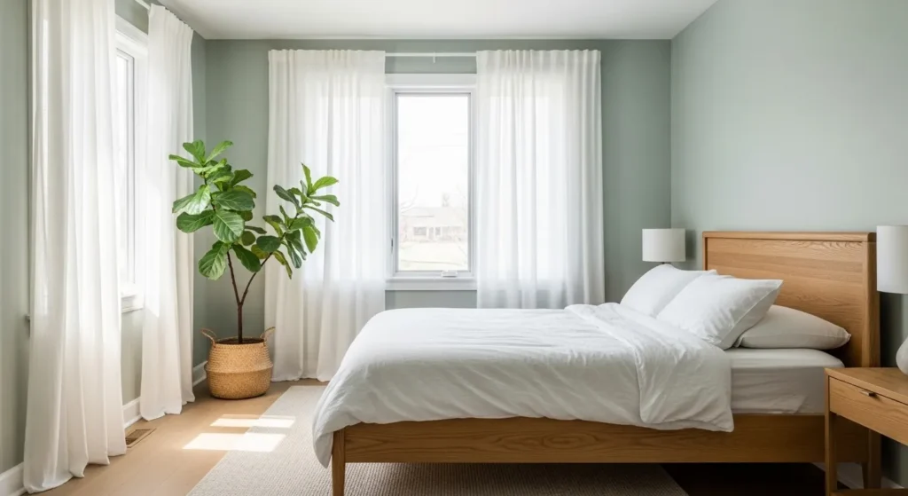
Sage green is widely considered one of the best choices for a relaxing environment because it brings the soothing essence of nature indoors. This muted shade of green acts as a neutral backdrop that pairs beautifully with organic materials like wood and stone. It promotes a sense of balance and renewal, which is essential for winding down after a busy day. Using this color on all four walls envelops the room in a gentle embrace without feeling overwhelming.
To maximize the effect of this shade, consider pairing it with white trim and natural textures such as a jute rug or a rattan light fixture. The combination of green and earth tones grounds the space, making it feel stable and secure. This approach ensures that your bedroom feels fresh and airy during the morning hours while remaining cozy and restful at night.
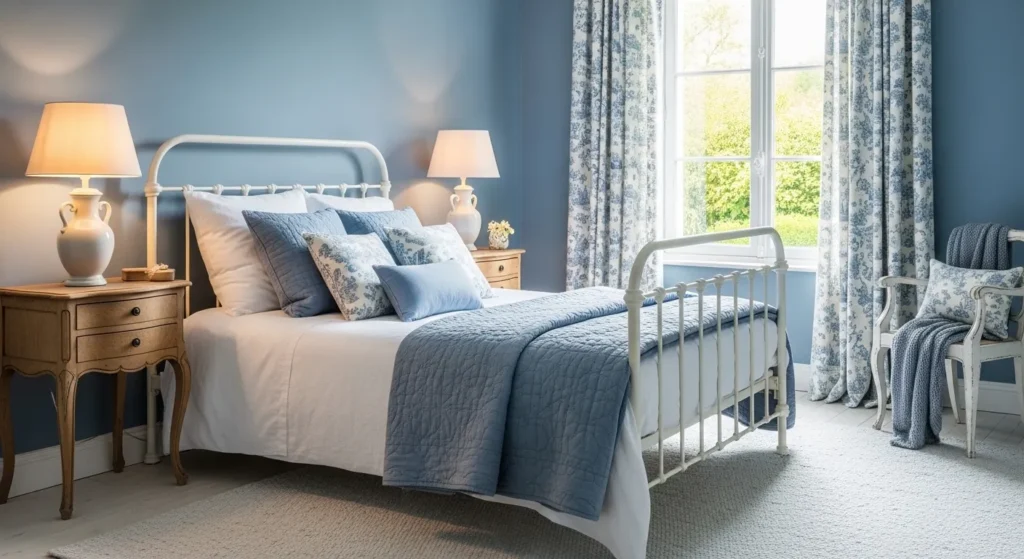
Airy Sky Blue Haven
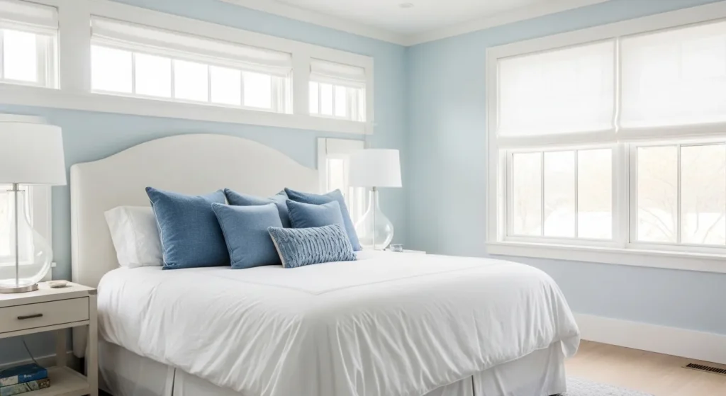
Pale sky blue is a classic choice that instantly lowers the heart rate and evokes memories of a clear, sunny day. This color is visually cooling, making it an excellent option for rooms that get a lot of warm sunlight or for sleepers who tend to run hot. By mimicking the color of the sky and ocean, this shade creates an expansive feel that can make smaller bedrooms appear larger and more open.
When decorating with sky blue, it helps to keep the rest of the palette simple and clean. White furniture and silver accents complement the cool undertones of the blue perfectly, creating a crisp and polished look. This specific color scheme is timeless and works well to create a spa-like atmosphere where you can easily drift off to sleep.
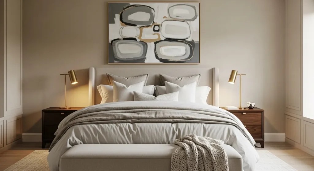
Warm Beige Comfort
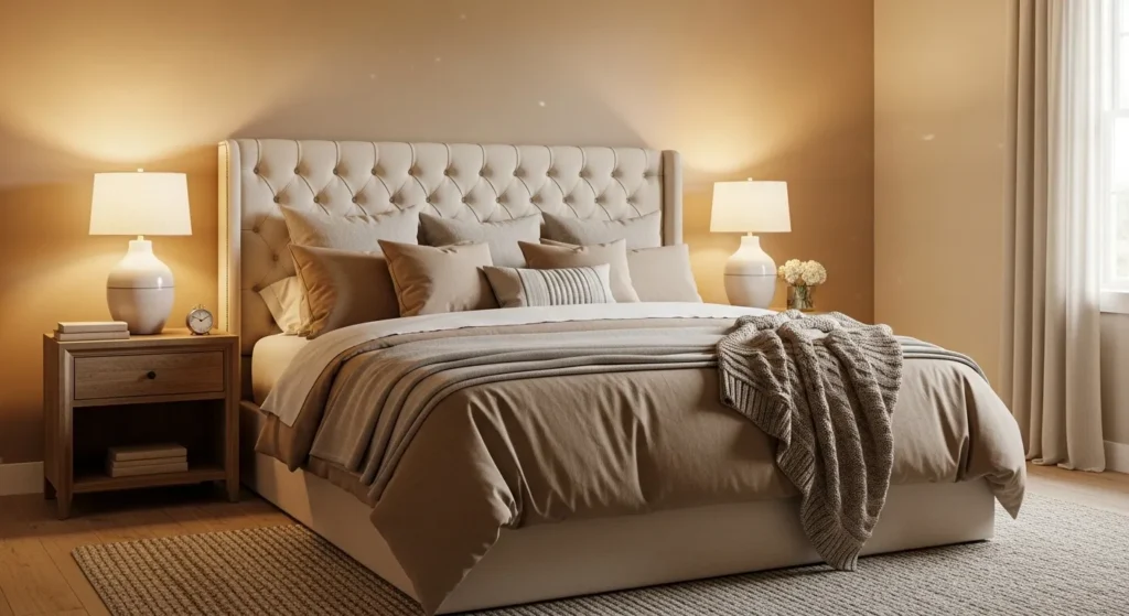
Warm beige is the ultimate neutral for those who want a space that feels like a warm hug. Unlike stark white, beige has yellow or red undertones that add depth and coziness to the room without being too dark. It serves as a perfect canvas for highlighting textures and fabrics, allowing you to layer different shades of cream and tan for a sophisticated monochromatic look.
Using warm beige as a base allows for great versatility if you decide to change your accent colors later. However, keeping the room strictly within a neutral palette reinforces a sense of calm and simplicity. This approach creates a clutter-free visual environment that helps quiet the mind before bed, making it one of the most effective calming bedroom color ideas.
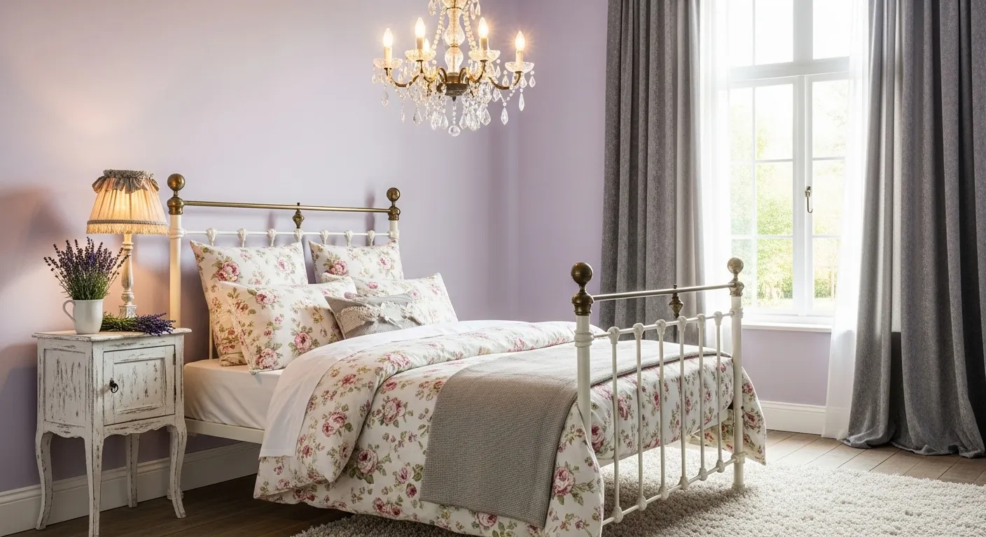
Soft Lavender Dreams
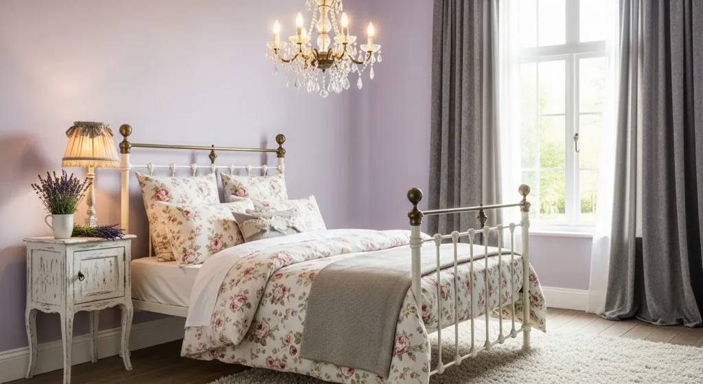
Lavender is often associated with relaxation and aromatherapy, making it a fitting choice for wall colors. This soft purple hue offers a touch of femininity and whimsy while maintaining a sophisticated edge if chosen in a muted tone. It bridges the gap between warm and cool colors, providing a unique atmosphere that feels both creative and restful.
To ensure the room looks grown-up rather than childish, pair lavender walls with grey or metallic accents. Silver mirrors and grey upholstery help to ground the purple tones and add a touch of luxury. The result is a dreamy space that feels personalized and unique, perfect for reading a book or relaxing in the evening.
Classic Dove Grey
Dove grey is a sophisticated alternative to white that adds just enough pigment to make the walls feel dressed. It is an incredibly peaceful color that reduces visual noise and creates a sleek, modern backdrop for your furniture. Because it is a true neutral, it does not demand attention, allowing your mind to rest easy as you prepare for sleep.
Lighting plays a crucial role in a grey room, as the shade can shift depending on the time of day. Warm lighting fixtures will prevent the grey from feeling too cold or clinical in the evening. By adding soft textiles and perhaps a touch of wood, you can ensure the space feels inviting and warm despite the cool wall color.
Creamy White Retreat
White walls are a staple in interior design, but choosing a creamy white rather than a stark bright white is key for a cozy bedroom. The slight yellow or brown undertones in cream soften the light and prevent the room from feeling sterile. This color reflects natural light beautifully, making the room feel happy and energized in the morning while remaining soft at night.
A cream palette relies heavily on texture to prevent the room from looking flat. Layering knitted throws, linen pillows, and wool rugs adds dimension and interest without breaking the color scheme. This purity and simplicity eliminate distractions, allowing you to focus entirely on rest and rejuvenation.
Muted Teal Tranquility
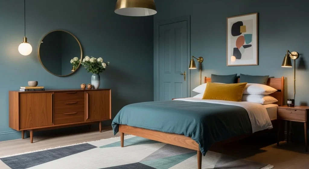
Muted teal offers a deeper, more enveloping sense of calm compared to lighter pastels. This rich blend of blue and green has a grounding effect that makes a large room feel more intimate and cozy. It is an excellent choice for those who want color and character in their space without sacrificing the peaceful vibe required for sleep.
Because teal is a stronger color, it pairs wonderfully with warm wood tones like walnut or mahogany. The contrast between the cool walls and warm wood creates a balanced and harmonious look. This color choice feels sophisticated and intentional, turning your bedroom into a boutique hotel-style escape.
Subtle Blush Pink
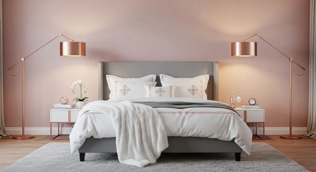
Blush pink has evolved from a nursery color to a chic and soothing option for adult bedrooms. This very pale shade of pink acts almost as a neutral, adding a warmth and glow to the room that is incredibly flattering. It creates a nurturing environment that feels safe and soft, which is ideal for reducing stress.
To keep the look refined, combine blush pink with modern silhouettes and neutral furniture colors like grey or white. Avoid excessive frills and opt for clean lines to maintain a sense of maturity in the design. This color creates a gentle, sunrise-like atmosphere that is uplifting to wake up to every morning.
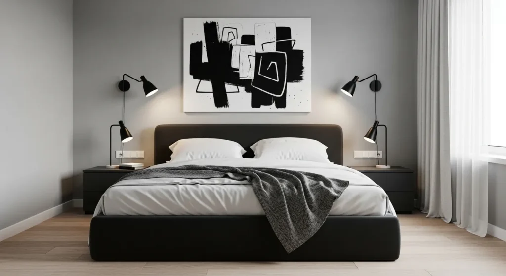
Moody Charcoal Depth
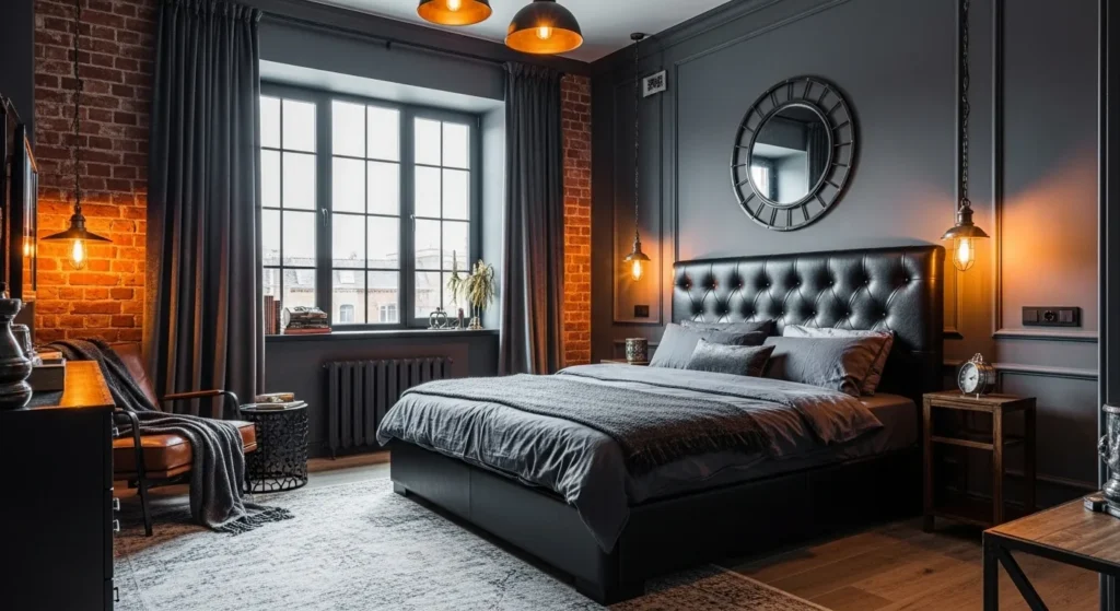
While dark colors might seem counterintuitive for some, charcoal grey can actually be incredibly soothing. Dark walls recede, blurring the boundaries of the room and creating a cocoon-like effect that feels very private and secure. This is particularly effective for people who have trouble sleeping, as the darkness signals the brain that it is time to rest.
To prevent the room from feeling like a cave, it is important to incorporate different textures and adequate lighting. Using lighter bedding or a light-colored rug can provide necessary contrast and keep the space from feeling too heavy. This bold choice results in a sophisticated sanctuary that feels completely separated from the outside world.
Earthy Terracotta Warmth
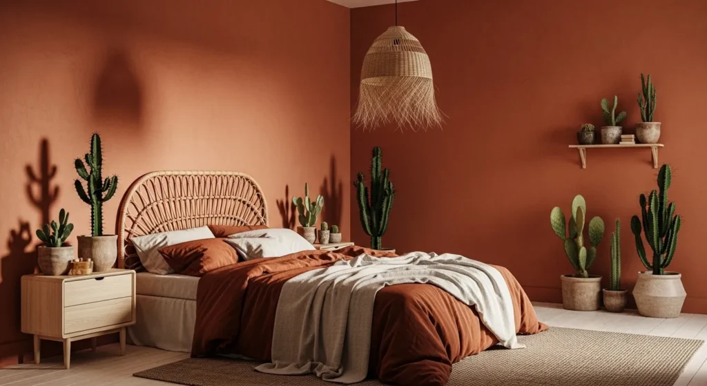
Terracotta is a rich, earthy hue that brings the warmth of the desert sunset into your home. This color is grounded and organic, fostering a connection to the earth that is naturally calming. It provides a cozy, wrapped-up feeling that is perfect for cooler climates or for anyone who wants their bedroom to feel physically warmer.
This color works best when paired with other natural materials like cane, rattan, and unpolished wood. The goal is to create a texture-rich environment that feels artisanal and lived-in. Embracing these earthy tones is one of the most unique calming bedroom color ideas for those who prefer warmth over cool blues and greens.
Dusty Blue Serenity
Dusty blue is a more muted, grey-infused version of sky blue that feels mature and elegant. The grey undertone dampens the brightness of the blue, resulting in a color that is easy on the eyes and very stable. It evokes the feeling of a cloudy day by the sea, which many find to be the perfect atmosphere for curling up with a blanket.
This shade pairs beautifully with vintage furniture and antique white finishes. It has a timeless quality that does not follow fleeting trends, ensuring your bedroom remains a stylish retreat for years to come. The soft contrast between dusty blue and warm wood tones creates a gentle visual rhythm that is conducive to sleep.
Versatile Greige
Greige is the perfect compromise between the coolness of grey and the warmth of beige. This hybrid color is incredibly adaptable and changes slightly depending on the light, keeping the room feeling dynamic yet restful. It offers the clean look of grey but with an added warmth that prevents the space from feeling stark.
Decorating with greige allows you to layer various textures and tones without fear of clashing. You can mix metals, woods, and fabrics easily against this backdrop. It is a safe, foolproof choice that guarantees a cohesive and harmonious environment, essential for a peaceful state of mind.
Midnight Navy Calm
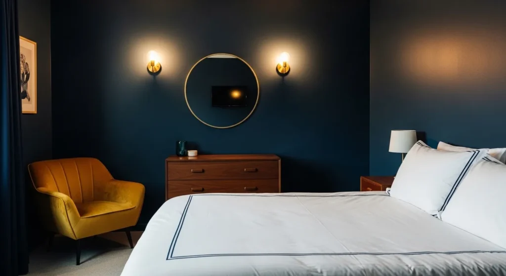
Midnight navy is a powerful color that brings the stillness of the night sky into your bedroom. Like charcoal, it creates a cozy, enclosed feeling that is perfect for hibernation and deep rest. The blue tones, however, maintain a sense of calm serenity that pure black might lack.
To balance the depth of the walls, incorporate bright accents like crisp white molding or metallic gold fixtures. These elements pop against the dark background, adding elegance and preventing the room from feeling gloomy. This dramatic yet soothing palette is perfect for those who want to make a statement while prioritizing sleep.
Restful Olive Green
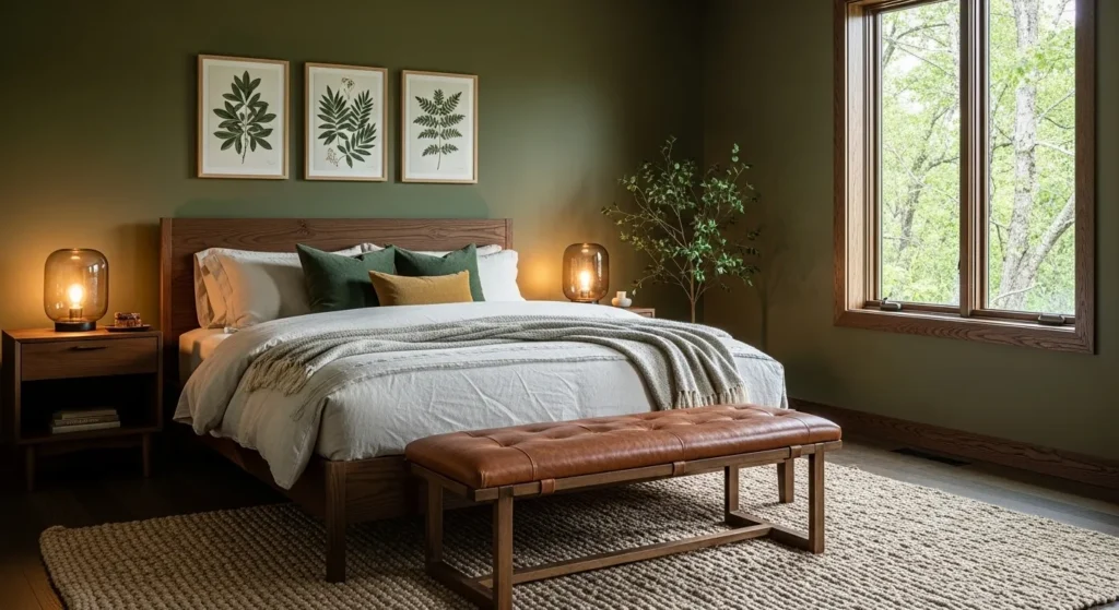
Olive green is a sophisticated, earthy tone that feels grounded and historic. It is darker and warmer than sage, offering a cozy depth that feels like a walk through a dense forest. This color connects deeply with nature, which is scientifically proven to lower stress levels and improve well-being.
This shade looks stunning when paired with leather, dark wood, and brass accents. It creates a masculine or gender-neutral space that feels curated and rich. The enveloping nature of olive green makes it a fantastic choice for reading nooks and sleeping areas alike.
Timeless Taupe
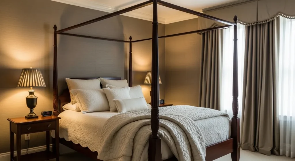
Taupe is a dark, brownish-grey that exudes elegance and stability. It is a grounding color that feels solid and permanent, providing a sense of security in the bedroom. Unlike lighter neutrals, taupe has enough saturation to make white trim and molding stand out crisply.
This color works exceptionally well with traditional furniture and rich fabrics like velvet or silk. It creates a sense of history and permanence that is very comforting. By choosing taupe, you are selecting a backdrop that is quiet and reserved, allowing you to disconnect from the chaos of the modern world.
Conclusion
Transforming your sleeping area does not require a complete renovation, as a simple fresh coat of paint can make a world of difference. By selecting one of these shades, you can create an environment that encourages deep sleep and relaxation. We hope these calming bedroom color ideas inspire you to curate a space that feels like a true sanctuary.