Creating a personal sanctuary often starts with the walls, and exploring different bedroom gallery wall layout ideas is the perfect way to infuse your space with character and warmth. Whether you are dealing with a massive blank space above your headboard or a small awkward corner, a thoughtfully arranged collection of art and photographs can completely change the atmosphere of your room. By mixing frames, playing with symmetry, or embracing an eclectic mix of textures, you can turn an ordinary bedroom into a stunning visual retreat. Let us explore these inspiring concepts to help you design a gallery wall that reflects your unique style and brings life to your bare walls.
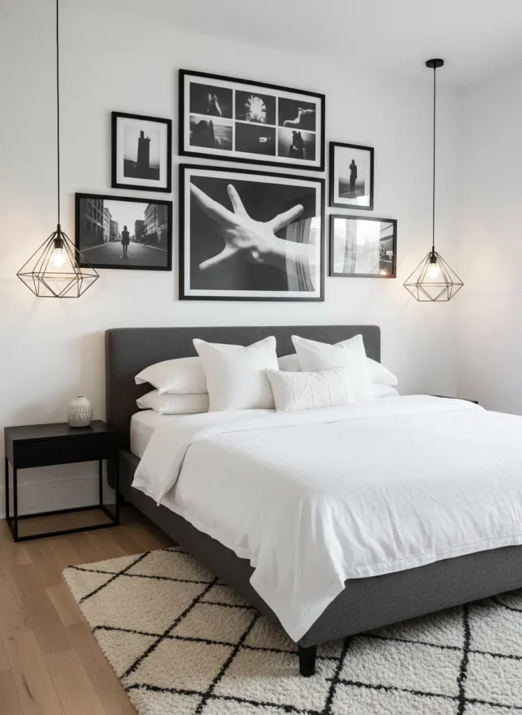
The Symmetrical Grid
The symmetrical grid is a classic approach that brings an immediate sense of order and calm to your bedroom. By using identical frames spaced perfectly apart, this layout creates a large, cohesive focal point that acts almost like a single piece of oversized art. It is an excellent choice for those who prefer clean lines and a minimalist aesthetic in their sleeping space.
This structured design works exceptionally well above a headboard or a long dresser. To pull this off, precision is key, so measuring your spacing carefully will ensure a professional finish. Using matching mats and a unifying theme for your artwork, such as all botanical prints or all black and white family photos, enhances the soothing, organized atmosphere necessary for a restful bedroom.
The Eclectic Salon Style
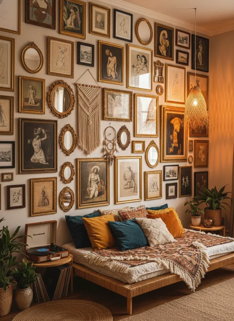
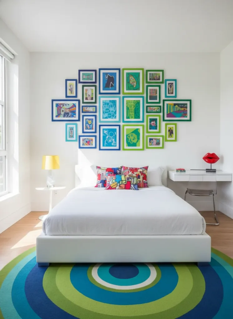
Embracing the eclectic salon style allows you to display a diverse collection of art without worrying about matching frames or perfect alignment. This layout grows organically over time, starting from the center and expanding outward in an irregular, visually fascinating pattern. It is the ultimate expression of personality, perfect for a maximalist or bohemian bedroom where more is always more.
The beauty of the salon style lies in its controlled chaos, which adds immense warmth and character to the room. To keep it from looking cluttered, maintain a consistent spacing between the mismatched frames and try to balance heavy pieces with lighter ones across the arrangement. Mixing media like oil paintings, typography, and even small wall hanging objects gives the gallery depth and keeps the eye moving across the display.
The Ledge Display
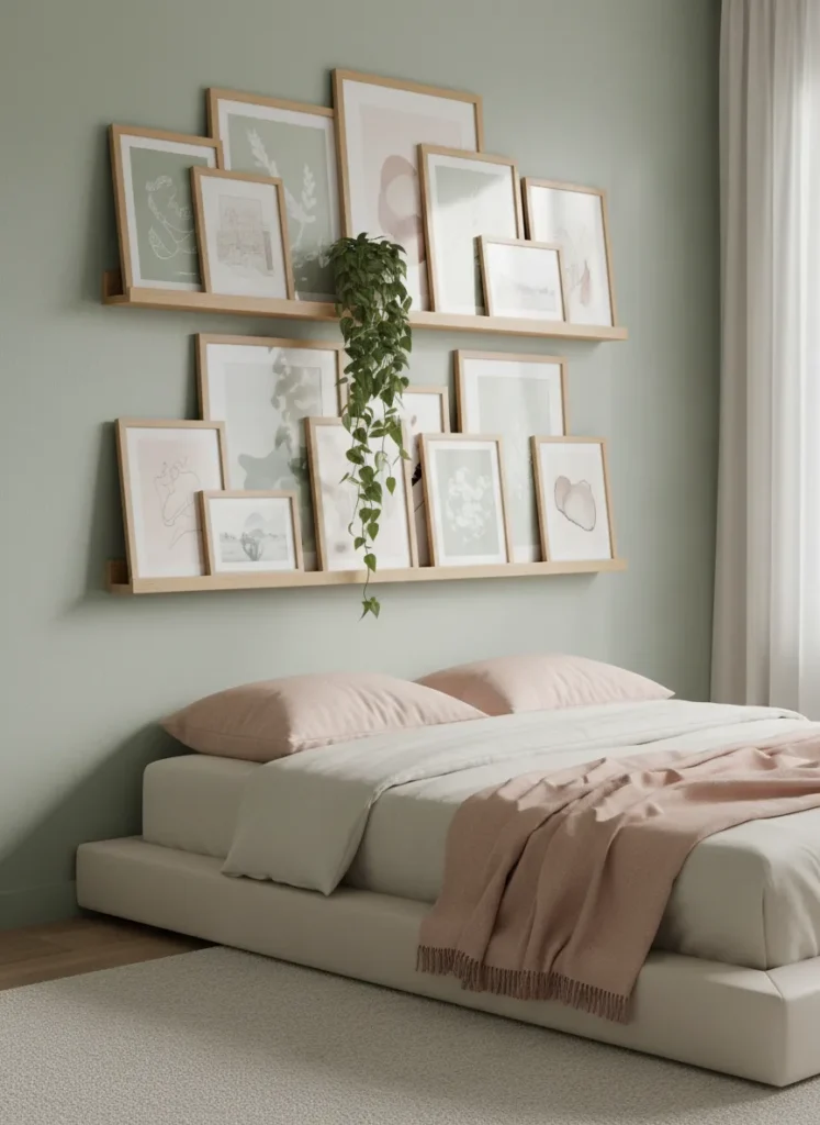
A picture ledge display offers a flexible and relaxed approach to creating a gallery wall in your bedroom. Instead of committing to a permanent arrangement with dozens of nail holes, you simply install one or two floating shelves and lean your framed pieces against the wall. This casual setup is ideal for people who love to swap out their artwork frequently or change their room decor with the seasons.
Layering is the secret to making a ledge display look intentionally styled rather than messy. Place your largest frames in the back to anchor the arrangement, then overlap smaller frames and canvases in front of them. You can also mix in small decorative objects, trailing plants, or books to add texture and dimension, making the wall feel like a curated collection of your favorite things.
The Corner Wrap
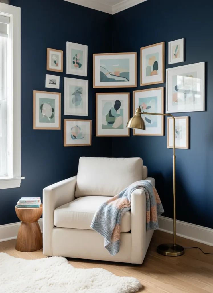
The corner wrap gallery wall is an inventive way to utilize awkward or empty corners in your bedroom. By continuing an art arrangement seamlessly across two meeting walls, you create an immersive, cozy nook that draws the eye inward. This layout works beautifully above a reading chair or a small vanity, turning an otherwise ignored area into a striking design feature.
To make the wrap-around effect look intentional, ensure that the spacing between frames remains consistent as the arrangement crosses the corner seam. It helps to anchor the layout with a larger piece on each side of the corner and surround them with smaller, complementary frames. This technique visually softens the harsh angles of the room and makes the bedroom feel more intimate and customized.
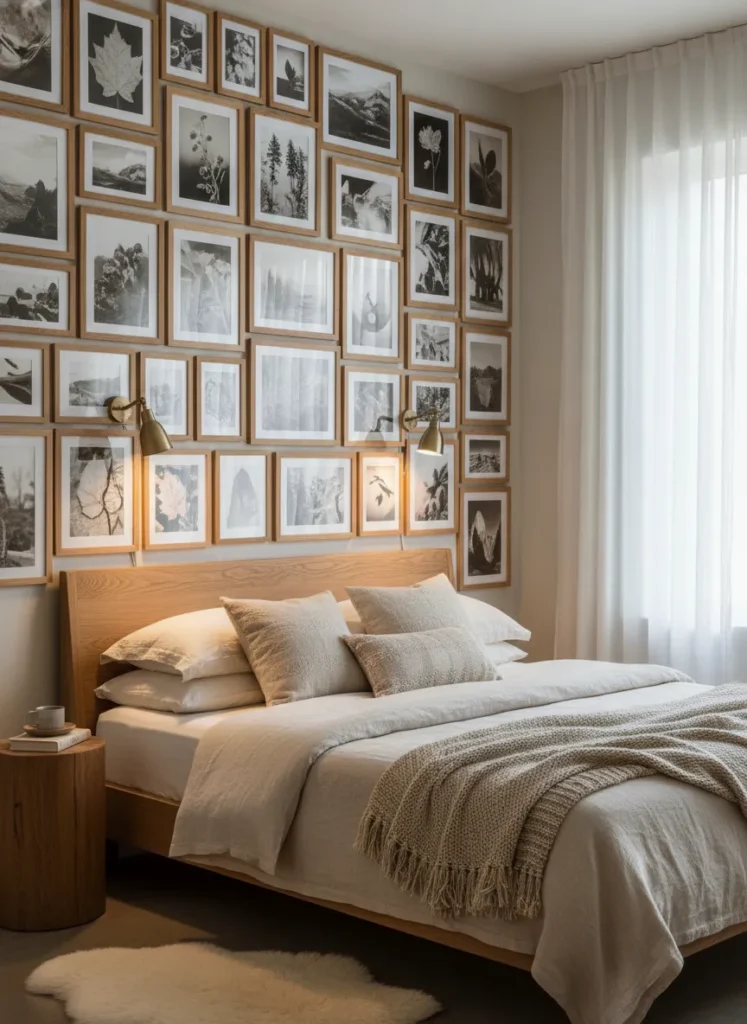
The Floor-to-Ceiling Statement
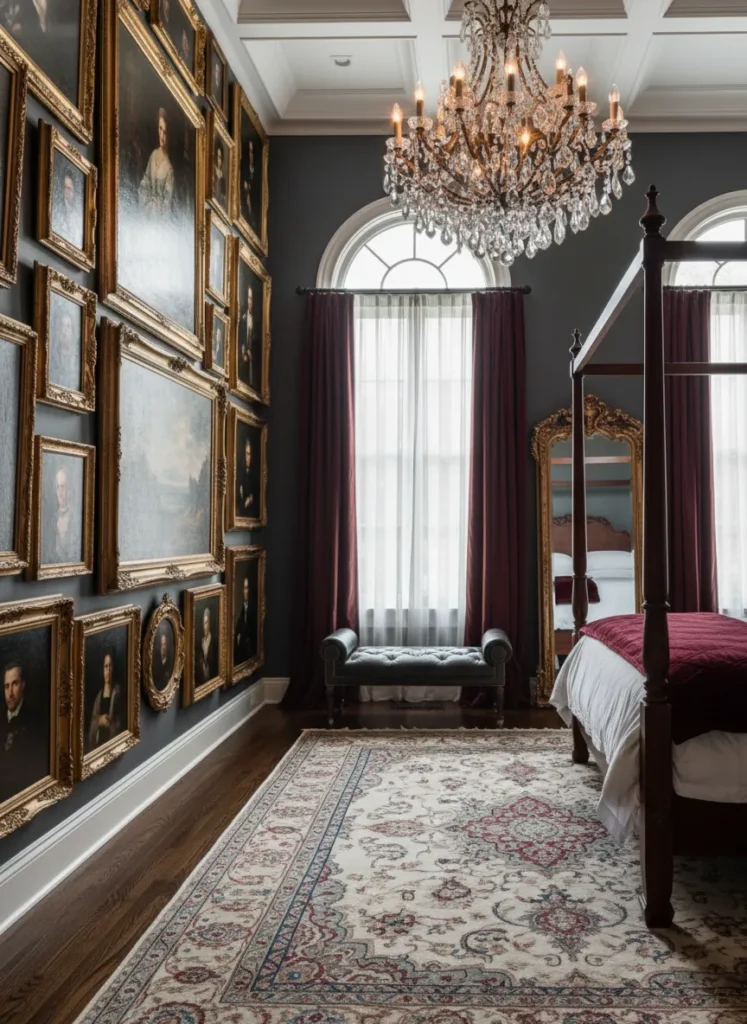
A floor-to-ceiling statement wall is a bold design choice that maximizes vertical space and draws the eye upward, making your bedroom ceilings appear much higher. This layout completely covers a narrow section of wall or an entire accent wall, leaving very little blank space. It is a dramatic, luxurious approach that makes a massive impact the moment you walk into the room.
When planning a floor-to-ceiling arrangement, it is best to place the most detailed or favorite pieces at eye level where they can be easily appreciated. Save the very top and bottom sections for larger, simpler pieces or artwork that reads well from a distance. Anchoring the bottom with heavier, darker frames can ground the display, ensuring the massive collection feels balanced rather than overwhelming.
The Staircase Effect
The staircase effect is a dynamic layout that arranges frames in a diagonal, stepped pattern. While traditionally used on walls beside actual stairs, this ascending layout is incredibly effective in bedrooms with vaulted or sloped ceilings. It naturally guides the eye upward, emphasizing the unique architectural features of your space while filling awkward triangular wall spaces.
Even in rooms with standard flat ceilings, a diagonal arrangement can bring a sense of movement and energy to a blank wall. To achieve this look, establish an invisible diagonal line across your wall and build your frame arrangement along that axis. Keeping the color palette of the artwork cohesive will ensure that the unusual shape of the layout remains the star of the show without looking chaotic.
The Asymmetrical Balance
Asymmetrical balance is all about creating visual harmony without relying on perfect mirror-image matching. In this layout, a large, visually heavy piece on one side is balanced by a cluster of smaller, lighter pieces on the opposite side. It provides a relaxed, contemporary vibe that feels effortlessly chic and highly curated.
This layout is perfect for showcasing a standout piece of art alongside smaller sentimental photographs or prints. The trick to making an asymmetrical arrangement work is managing visual weight rather than physical size. Darker colors and thicker frames draw the eye more strongly, so placing a few dark, small frames on one side can easily balance a large, light-colored canvas on the other.
The Mixed Media Display
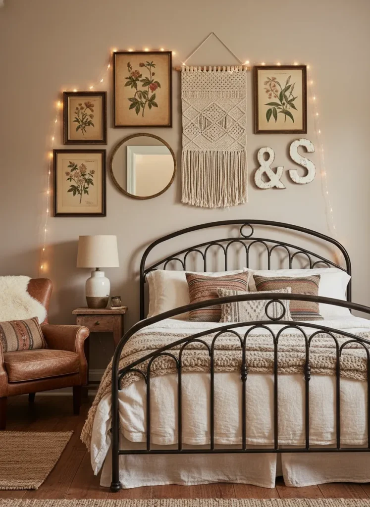
A mixed media display breaks the traditional rules of a gallery wall by incorporating three-dimensional objects alongside standard framed art. By blending paintings and photographs with mirrors, woven tapestries, sculptural pieces, or even hats, you add incredible texture and depth to your bedroom walls. This approach brings a tactile quality that makes the room feel cozy and deeply personal.
Incorporating different materials prevents the wall from feeling flat or sterile. A mirror placed within the arrangement can reflect light and make a small bedroom feel more spacious, while a textile piece adds softness. When building a mixed media wall, treat your three-dimensional objects just like frames, giving them equal breathing room and integrating them seamlessly into the overall flow of the layout.
The Triptych Focus
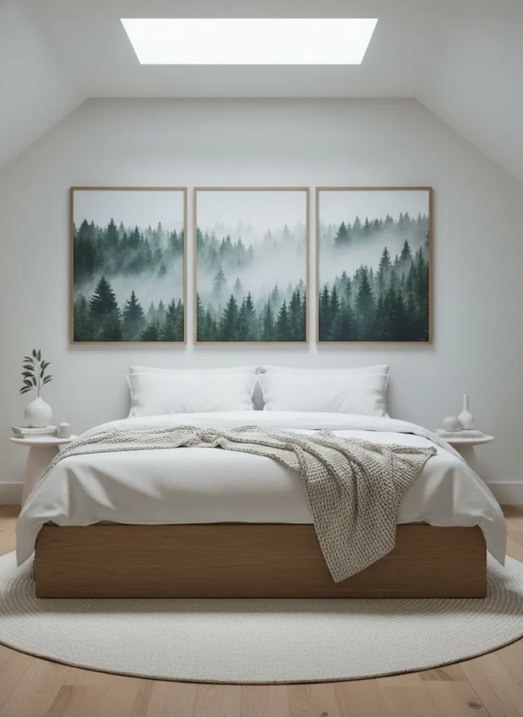
The triptych focus uses three large, equally sized panels that either display a continuous image or three closely related artworks. This layout creates a massive, unified focal point that commands attention without creating visual clutter. It is an incredibly sophisticated and modern approach that brings a sense of high-end art gallery elegance into your personal sanctuary.
Because the triptych relies on only three large pieces, it is much easier to hang and align than a complex arrangement of dozens of small frames. This layout works exceptionally well over a king-sized bed, providing the perfect scale to match wide furniture. Choosing a calming image, like a landscape, abstract watercolor, or botanical series, enhances the relaxing atmosphere essential for a good night of sleep.
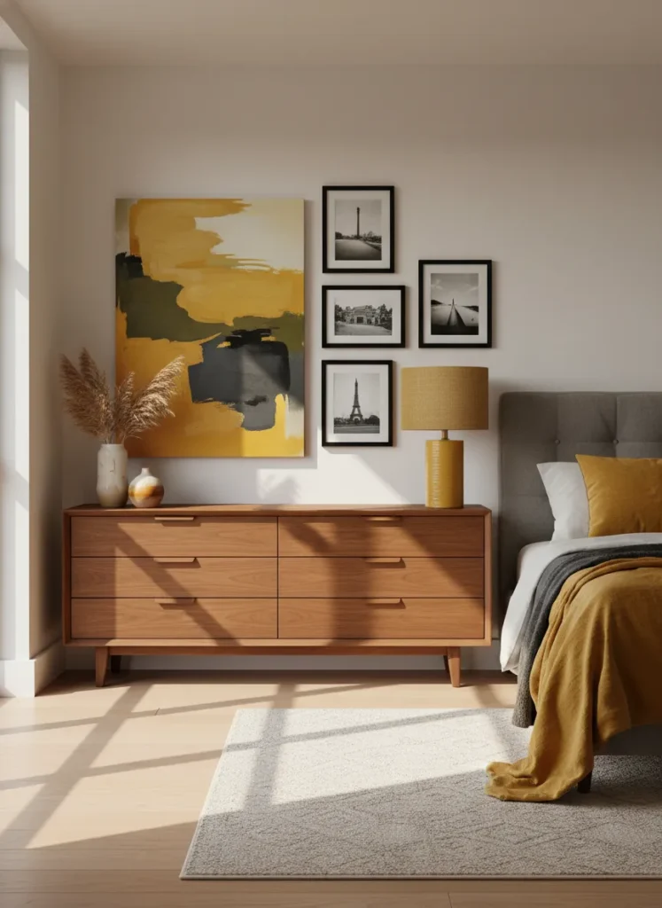
The Color Block Arrangement
A color block arrangement organizes your artwork based on hue, creating a stunning gradient or blocked effect across your bedroom wall. Instead of mixing colors randomly, you group pieces with similar color palettes together. This creates a powerful visual impact that feels both playful and highly organized, turning your art collection into a cohesive mural.
This layout is an excellent way to tie together mismatched art styles, as the unifying color scheme prevents the display from looking messy. You can create a subtle ombre effect fading from dark to light, or bold blocks of contrasting colors for a more retro look. Pulling one or two of these colors into your bedding or throw pillows will seamlessly integrate the gallery wall into the overall bedroom design.
The Vintage Arch
The vintage arch layout arranges your frames to form a gentle curve or semi-circle at the top, mimicking architectural arches. This soft, rounded shape is incredibly romantic and breaks up the harsh straight lines typical of bedroom furniture and windows. It works beautifully as an alternative headboard, hugging the space above your pillows with a comforting, protective shape.
To create this look, start by placing your highest frame in the center and slowly taper the arrangement downwards on both sides. Using vintage or ornate frames enhances the classic, timeless feel of the arch shape. This layout is particularly striking in rooms with tall ceilings, as it draws the eye upward while maintaining an intimate, cozy atmosphere directly around the bed.
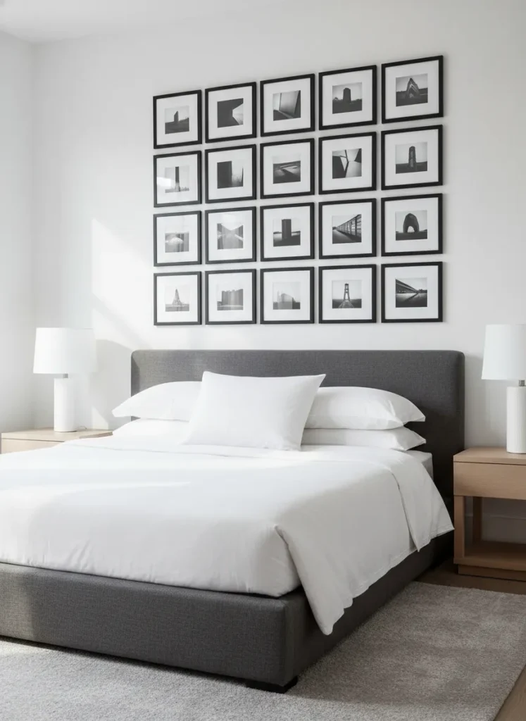
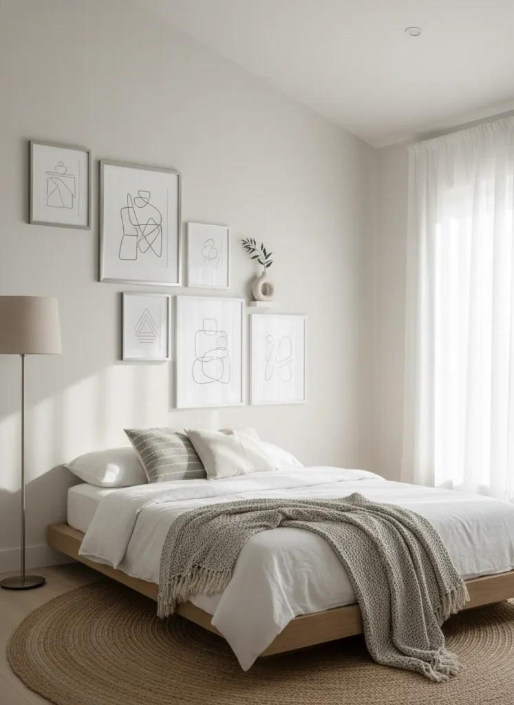
The Minimalist Line
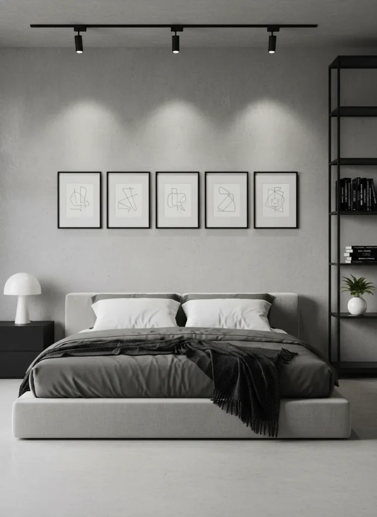
The minimalist line layout strips the gallery wall down to its most basic, elegant form by arranging frames in a single, perfectly straight horizontal row. This highly structured approach creates a wide band of visual interest that makes the room feel wider and more expansive. It is the perfect solution for those who love art but want to maintain a calm, uncluttered environment.
The success of the minimalist line relies entirely on precision and consistency. Using identical frames, matching mat sizes, and a cohesive theme for the artwork ensures the row looks like a deliberate architectural feature. Placed about eye level or perfectly centered between the top of the headboard and the ceiling, this layout offers a striking, modern aesthetic that feels incredibly refined.
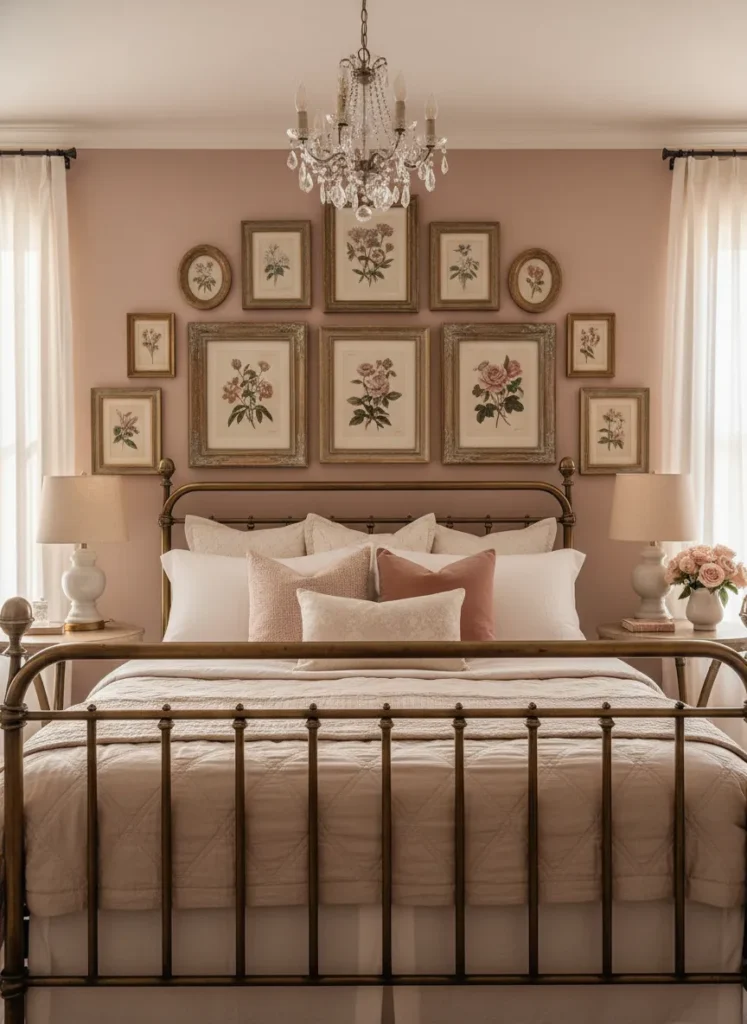
The Theme-Based Cluster
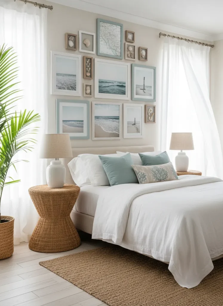
A theme-based cluster brings together various pieces of art and objects that all share a single, distinct subject matter. Whether it is a collection of botanical prints, travel photography from a specific trip, or vintage maps, centering your layout around a theme tells a complete story. This highly personalized approach turns your bedroom wall into a visual diary of your passions.
Because the subject matter is so unified, you have the freedom to play wildly with different frame shapes, sizes, and textures without losing cohesion. Clustering the pieces closely together reinforces the idea that they belong to a single collection. This layout is an excellent conversation starter and brings a deep sense of joy to your bedroom, as you are surrounded by the things you love most.
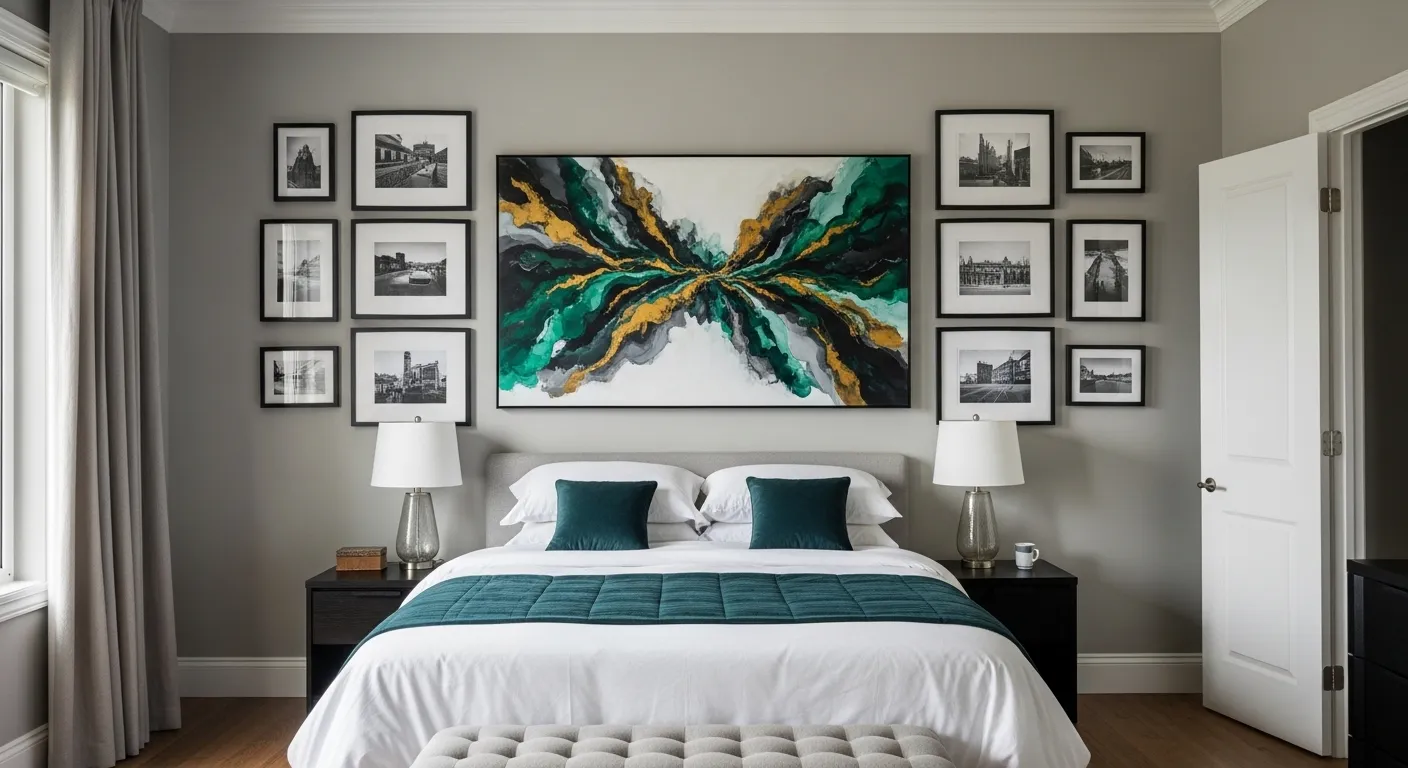
The Oversized Anchor
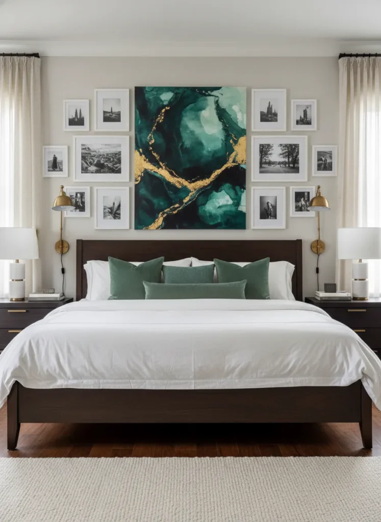
The oversized anchor layout uses one massive piece of art as the undisputed focal point, surrounding it with a constellation of much smaller frames. This layout solves the problem of having one favorite piece that feels a bit too lonely on a large blank wall. The central piece grounds the arrangement, while the smaller pieces add fascinating detail and texture around the edges.
When using an oversized anchor, center your large piece first and build the smaller frames outward, almost like a frame for the frame itself. This allows the eye to immediately rest on the main artwork before wandering to discover the smaller, supporting pieces. It is a fantastic way to blend a grand statement piece with smaller, more intimate photographs or sketches in your bedroom.
The Organic Cloud
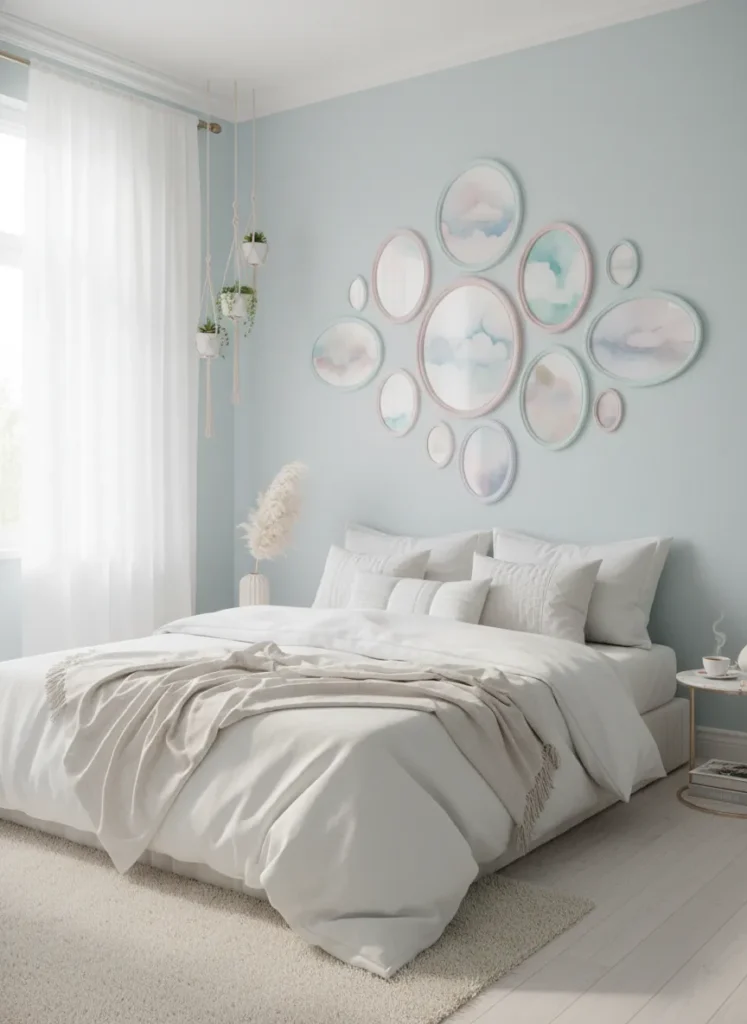
The organic cloud layout abandons straight lines and sharp corners in favor of a soft, irregular, floating arrangement. By grouping frames in a loose, rounded cluster that fades out at the edges, you create a dreamy, ethereal vibe perfectly suited for a bedroom. This layout feels spontaneous and light, avoiding the rigid formality of traditional grid layouts.
To achieve the cloud effect, mix round, oval, and softly curved frames among standard rectangles to break up the hard angles. Keep the spacing slightly tighter in the center of the arrangement and let the outer frames drift slightly further apart. This layout works beautifully with soft, romantic artwork like watercolors, floral photography, or abstract pastels, enhancing the serene atmosphere of your sleeping space.
The Black and White Contrast
A black and white contrast layout relies on the timeless elegance of monochrome artwork to make a powerful visual statement. By removing color from the equation, the focus shifts entirely to the composition, contrast, and emotion of the pieces. This layout brings an incredible level of sophistication and modern drama to the bedroom without clashing with your existing decor.
This high-contrast approach is incredibly versatile, working beautifully against both stark white walls and moody, dark paint colors. Mixing different styles of art, such as typography, architectural photography, and abstract ink sketches, keeps the monochrome display visually stimulating. Using identical black frames with oversized white mats elevates the look, making your bedroom feel like an upscale contemporary art gallery.
The Headboard Extension
The headboard extension layout treats your gallery wall as a direct continuation of your bed frame. By aligning the outer edges of the art arrangement exactly with the width of your headboard and building upward, you create a towering, unified focal point. This technique makes your bed look grander and draws the ceiling upward, adding a sense of volume to the room.
This layout is especially useful in small bedrooms where floor space is limited, as it maximizes vertical impact without requiring extra furniture. To make the extension feel seamless, use frame colors that match or complement the material of your headboard. Tightly packing the frames within these invisible boundaries ensures the arrangement looks like a deliberate architectural column rather than a random scattering of art.
The Leaning Floor Gallery
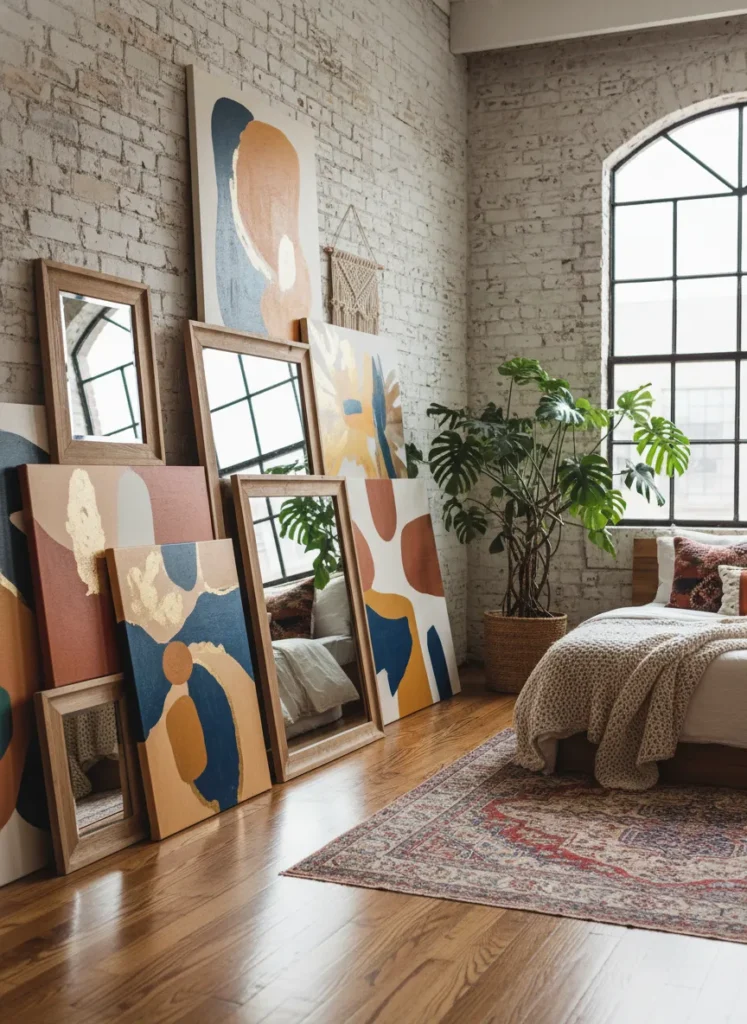
The leaning floor gallery is an ultra-casual, bohemian layout that completely ignores the hammer and nails. Instead of hanging pieces on the wall, you lean oversized art, mirrors, and large frames directly against the baseboards, layering smaller pieces in front of them. This relaxed approach brings a cool, artist-studio vibe to your bedroom and is perfect for renters who cannot drill into their walls.
Because the artwork is grounded on the floor, this layout draws the eye downward, creating a cozy, grounded feeling in the room. It is essential to use very large pieces as your base layer so they do not look like forgotten clutter left on the floor. Layering different textures, like a sleek mirror behind a rough canvas, adds incredible depth and makes this effortless look feel intentionally styled.
The Picture Rail Elegance
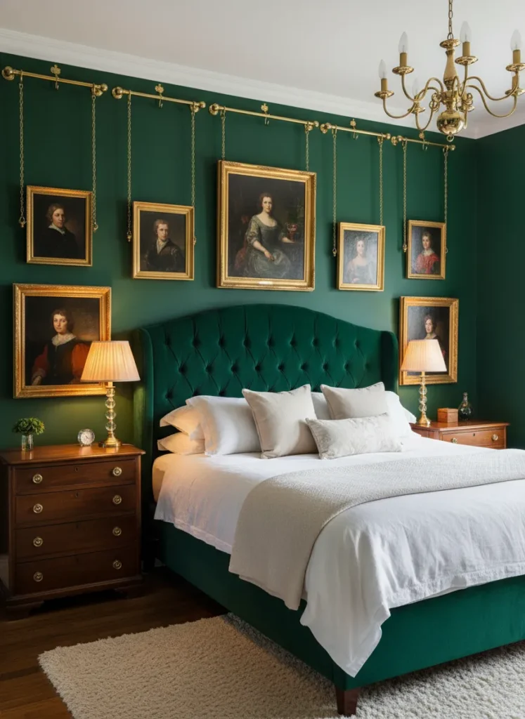
The picture rail layout embraces historical elegance by using traditional molding and hanging hardware to display your gallery wall. Instead of nailing directly into the drywall, frames are suspended from a high wooden rail using decorative cords, ribbons, or brass chains. This method brings an immediate sense of vintage charm and architectural interest to a plain bedroom.
This system is incredibly practical, allowing you to slide artwork horizontally or adjust the height without ever damaging your walls. The visible hanging chains or ribbons become a decorative element in themselves, adding vertical lines that draw the eye upward. It is a stunning choice for older homes with existing molding or for anyone looking to add a touch of classic, old-world romance to their sleeping quarters.
The Shadowbox Showcase
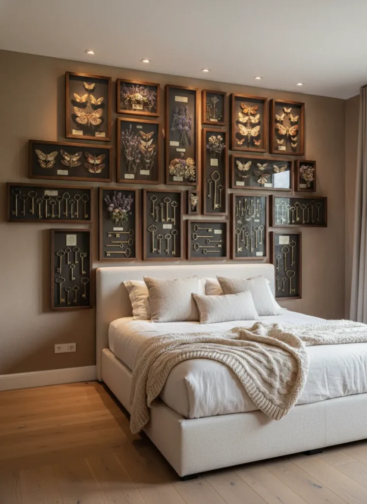
A shadowbox showcase layout adds literal depth to your walls by using deep, glass-fronted boxes instead of flat frames. This layout allows you to display cherished three-dimensional keepsakes, such as dried wedding bouquets, vintage jewelry, or travel souvenirs, turning them into museum-quality art. It adds a wonderful tactile element to the bedroom that flat prints simply cannot replicate.
Because shadowboxes cast their own internal shadows, this layout thrives with good directional lighting. Grouping them together creates a grid of fascinating mini-exhibitions that invite you to step closer and inspect the details. Mixing a few flat framed photos among the deep shadowboxes can balance the heavy visual weight, creating a highly personal and deeply sentimental gallery wall.
The Wrap-Around Window
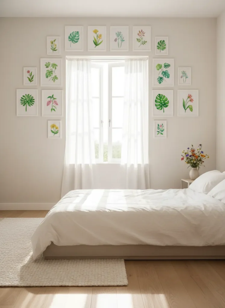
The wrap-around window layout cleverly utilizes the often-ignored slivers of wall space surrounding your bedroom windows. By framing the architectural feature with a curated collection of small-scale art, you turn the window and the view outside into part of the gallery itself. This layout draws attention to natural light sources and makes the entire wall feel thoughtfully designed.
To pull off this look without overwhelming the window, stick to lighter frames and airy, cheerful artwork that complements the outdoors. Keep the arrangement symmetrical on both sides of the window for a tailored look, or go slightly asymmetrical for a more relaxed feel. This inventive use of space is perfect for smaller bedrooms, ensuring every inch of wall space contributes to the room’s character and charm.
Conclusion
Transforming your blank walls into a beautiful display of your personal style does not have to be intimidating. By experimenting with these bedroom gallery wall layout ideas, you can easily create a focal point that brings warmth, character, and joy to your space. Whether you prefer the clean lines of a symmetrical grid or the cozy chaos of a mixed media arrangement, the perfect layout is simply the one that makes you feel most at home. Gather your favorite pieces, grab a hammer, and start designing the bedroom sanctuary of your dreams today.